Monthly Challenge 1 – All in the Family

Happy Friday Everyone!!

I’d like to introduce you to my very first Monthly Challenge. Each month I will challenge you to make something based on the criteria I provide. When you finish the challenge, I would love for you to share your creation with others.

If you have a Facebook account, share your image on my wall.

If you have a Pinterest account, follow me on Pinterest.

Then let me know in the comments below that you’ve pinned your creation to your own board. I’ll repin it to my account on the appropriate monthly challenge board. Just put ArtsyCraftyKaty Monthly Challenge (whatever the number is) in your description. Here’s the link to this month’s board.

Little tip: If you’re posting an image online, it’s always a good idea to add your own identifying watermark on the image. This way no one can claim it’s his or her own creation. To learn more about watermarks and how to add them click here.

Ok, on to this month’s Challenge!

ACK_challenge1

Like the title implies we’re keeping it in the family, a color family!

I’d like you to make a Mother’s Day card using one color family. For example, you could use papers that have varying shades of reds.

To help you understand what I mean by color families, I think this link to Sherwin-Williams provides a good visual representation.

I also created an inspiration board on my Pinterest account that you can check out here.

Some people think that limitations are just that, a limit on your creativity. I disagree. I think it challenges you to this outside the box and stretch your creative muscles.

Feel free to incorporate this month’s Technique Spotlight too!

You have until Sunday, May 12 (Mother’s Day) to share your creations.

Have fun everyone and happy crafting!

Envelope Size Cheat Sheet

When I’m making a card that I want to mail to someone, one of the things I always struggle with is envelope size. I’m never sure what size to make my card to fit in the envelope. It seems like I try something new every single time!

In an effort to help myself out because I’m terrible at measurements and numbers in general, I decided to make a basic guide  for myself. I’m going to share it with you in case there’s anyone else out there suffering from the same issues I have! Remember, if you have an unusual sized envelope, make a thick design or have embellishments that cause the surface of the envelope to be bumpy, you’ll have to pay extra for manual processing by the post office.

Here are six basic envelope types:

Business Envelopes The most common type you get in the mail. There are a few standard designs within this group: Commercial Flap (like most of the “junk mail” comes in), Square flap, Wallet Flap, Side Seam and Policy.

Image

These come in a variety of sizes but the most popular size is the standard #10 envelope which measures 4.125” x 9.5”.

Whatever you’re designing, the best size for the final product (after folding) would be 4” x 9.25”.

Booklet Envelopes: These are larger envelopes for things like booklets (obviously!) brochures, and other sales material. I believe my Tiffany’s catalogues come in a booklet envelope. Big girls version of the Sears Christmas catalogue! Anyone else have that memory of flipping through the fat, glossy Sears catalogue and making your list for Santa based on what you found in there?

Booklet EnvelopesImage

These can come in a variety of sizes but for cards I personally would stick around 5.5”  x 7.5”.

The final design for this size envelope should be 5.25” x 7”.

Catalog Envelope: This design is ideal for Catalogs because it has a center seam that makes it sturdier and can handle heavier contents. I’m going to skip this envelope because it’s hardly ever used for card designs.

Square Envelopes: These are a modern design that is sure to stand out in someone’s pile of mail. However you should know that this shape requires extra postage because it’s considered “nonstandard.”

Square Envelopes

Image

Whatever square shape you decide to go with, a good rule of thumb is to shave off .25” from the final card design. For example if you’re going with a 5” by 5” envelope, you’d go with a design that was 4.75” x 4.75”

Baronial Envelope: These are more traditional greeting card envelopes with the triangle shaped flap. You also see them used for invitations to a wedding or other special event. These also are available in a variety of sizes. Since it’s a more popular card envelope I’m going to provide a few size options. [http://www.envelopes.com/invitations/pointed-flap-envelopes]

Pointed Flap Envelopes

Image

Envelope 3.625” x 5.125”, your final piece should be 3.5” x 4.875”

Envelope 4.75” x 6.35”, your final piece should be 4.625” x 6.25”

Envelope 5.25” x 7.25”, your final piece should be 5.125” x 7”

A-Style Envelope (also called Announcement): This style is commonly used for stationary, cards and invitations. Where the Baronial envelope has a traditional triangle shaped flap, the A-style is squared off and is more modern in design. [http://www.envelopes.com/invitations/square-flap-envelopes]

Square Flap Envelopes

Image

A-2 Envelope 4.375” x 5.75”, your final piece should be 4.25” x 5.5”

A-6 Envelope 4.75” x 6.5”, your final piece should be 4.625” x 6.25”

A-7 Envelope 5.25” x 7.25”, your final piece should be 5.125” x 7”

A-8 Envelope 5.5” x 8.125”, your final piece should be 5.375” x 7.875”

A-9 Envelope 5.75” x 8.75”, your final piece should be 5.5” x 8.5”

A-10 Envelope 6” x 9.5”, your final piece should be 5.875” x 9.25”

I hope this information helps!

If you want more information about guidelines for mailing, I encourage you to visit the United States Postal Service website!

Technique Spotlight – Heat Embossing

I’m very excited to introduce our very first Technique Spotlight!

Heat Embossing!

I personally love heat embossing. I think it gives a more polished look to projects if that’s the look you’re going for. It’s so versatile too! You can stamp in color and use clear embossing powder.  You can stamp with a clear, sticky ink.  like Versamark as an example, and then use a pigmented embossing powder. I’ve found if a stamp I’m working with is giving me trouble when I try to emboss over it and I have gaps in the embossing, if I first stamp in a color and use the same color embossing powder on top,  it can hide imperfections. If I want a subtle look, I stamp with the clear, sticky ink to give a watermark effect, and then use clear embossing powder over it.

See! So many options

I found the following tutorial for heat embossing on YouTube by CraftALotAustralia. It has over 125,000 views! CraftALotAustralia doesn’t appear to be posting videos anymore but this tut clearly explains the steps and is easy to follow.


Here’s a list of products you’ll need on top of the basics (basics being paper, stamps and standard ink pads.) I’ll provide you options for products you can order through Stampin’ Up, other online retailers or that you may find at local hobby stores where links are available.

Disclaimer: I am not a Stampin’ Up representative although I was one in the past. I am not being paid by any manufacturers of the products I mention. I cannot vouch for the quality of the products I mention. I am simply providing you options. You in turn can then do research and come to your own informed decisions and opinions. However, please feel free to share opinions in the comments that may help other readers.

Heat Embossing Gun

Through Stampin Up

On Google Shopping

Clear, Embossing Inkpad

On Google Shopping

Versamark through Stampin’ Up

Versamark on Google Shopping

Embossing Powder

Through Stampin’ Up

On Google Shopping

Have fun experimenting with this technique. If you have questions, leave them in the comments section. I encourage everyone to feel free to help each other out through the comments section. Remember we’re all here to learn and have fun.

Happy Crafting!

More Inspiration and Exciting News!

Happy Hump Day!

It’s Wednesday and I wanted to give you all a little taste of things to come and get you excited for the weekend. (As if you needed a reason to be excited.) I’m going to be starting some fun new concepts here on Artsy Crafty Katy that I hope you’ll enjoy!

To kick things off, I’m going to continue with the theme I started in my last post – Mother’s Day. We’ll run with this theme for a few weeks and then we’ll change it up. As part of the monthly theme I’ll be doing two features. The first is the Technique Spotlight where I’ll provide you information on a technique that I think is fun and will be something you can incorporate into your projects right away. The second will be a Monthly Challenge. I’ll provide you certain criteria that you’ll use to create a project. I’d love for you all to share your monthly challenges with me on Pinterest too! I’ll explain this further when I introduce the challenge for this month.

Ok, enough chatter! It’s time to share some inspiring ideas by some very talented crafters. Let me know if you can figure out what the common thread is that ties all these great examples together.  This commonality is going to be the feature of our first Technique Spotlight!

This design is so sweet. I think the water color effect behind the flowers is perfect for a Mother’s Day card.

Mothers-Day-Card

http://inkitupwithjessica.com/category/techniques/

I love the use of mixed media on this card. There are pearls, paper, brads, flowers and hearts. Stunning!

151607

http://lynn-mccorry-2.blogspot.com/2010/04/two-mothers-day-cards.html
This next inspiration uses several different textures and layers to create lots of visual interest.

2384296_orig

http://www.snail-loves.com/1/category/mother/1.html

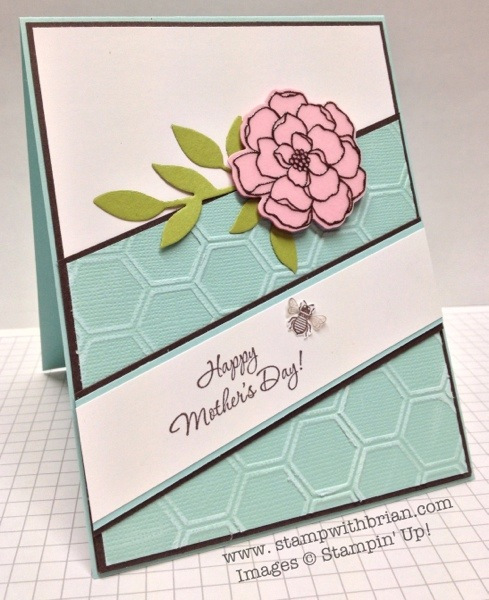
This might be my favorite out this batch. You’ll notice that it uses the same flower stamp from the first example, but that’s not the common thread. I think it’s the mix of textures and angles broken up with the single flower that grabbed my attention.

20130309-170148

http://stampwithbrian.com/2013/03/10/happy-mothers-day-pp136-color-challenge/

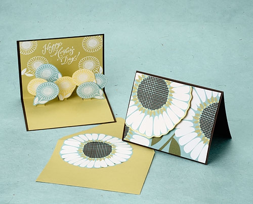
If you’re an advanced papercrafter or feeling ambitious, this one is for you! Three dimensional cards are so much fun!

Mothers_day_card_ideas

http://blog.paper-source.com/how-to/how-to-mothers-day-pop-up-card/

And this last card should give you the biggest hint about what our Technique Spotlight will be about.

celebrate your day card

http://www.susiewittwer.com/2011/10/guest-designer-at-lily-pad-cards.html

I’ll give you a couple of days to look over these beautiful inspirations and get your own wheels turning. Stay tuned because this weekend I’ll introduce our very first Technique Spotlight! I’m so excited!

Happy Crafting!

Mother’s Day Ideas and Boston

Hello friends!

I want to apologize for not posting this week. Everything that was going down in Boston was truly at the front of my mind. Boston is my home away from home. I went to college two towns over from Watertown. My best friend in college was from Watertown. When I graduated, I lived in Watertown for a period of time and a majority of my friends still live in the suburbs of Boston. I’ve spent countless hours in the city, both working and playing.

What happened in Boston and Watertown was horrific.

I took it personally. Boston is “my city” and I’m sure many others out there feel the same way about this historic, proud and vibrant tangle of streets, buildings and people. You don’t do this to “our city” and get away with it.

There are still more questions than answers about the events of this past week but I do know this…the people of Boston, whether they live in the city, in the suburbs, or beyond, have shown that their strength and spirit are unshakable.

Bostonians, you make me proud.

Boston Strong.

And now that I’ve gotten that off my chest, it’s time to resume our regularly scheduled lives.

Mother’s Day is coming up and instead of procrastinating like I may have done for Easter; I want to get a jump on things. I’ve been scouring the Internet for card ideas and have gathered up five that have sparked my creativity. Maybe one of them will inspire you too.

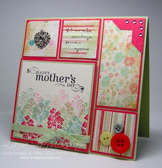
This first idea is from Laura at Scrapnextras.

I really like the idea of mixing different sized squares and rectangles and using patterned paper to break up the shapes. It’s a simple design bumped up a notch. You can take it in so many directions. Use pastel papers and accent with pearls and jewels. Use bright colors and accent with buttons, rivets and other hardware. The options are endless!

6a00e54f0b0f7188340133ed6ab059970b-320wi

http://www.scrapnextras.com/scrapnextras/2010/05/sweet-sunday-sketch-68-happy-mothers-day.html

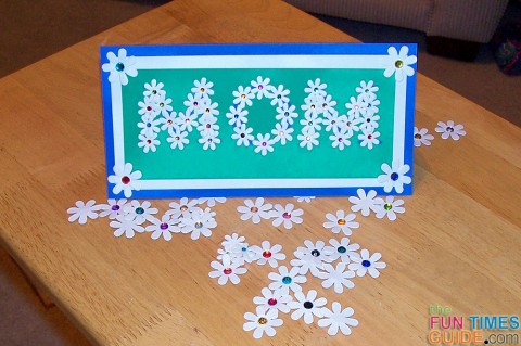
This example from Suzie at The Fun Times Guide to Stamping and Scrapbooking uses flower shapes that she purchased but you could certainly use a flower punch if you have one or even a small heart punch. Experiment with punching shapes out of colored paper and patterned paper to add visual interest.

make-a-mothers-day-card-480x319

 http://stamping.thefuntimesguide.com/2013/04/how-to-make-a-mothers-day-card.php

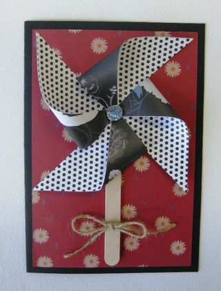
It doesn’t exactly say Happy Mother’s Day on it’s own, but this design I found on Rasberry’s blog could certainly be tweaked to give it that feeling. How about pairing your mother’s favorite color for a base paper and then picking a patterned paper that incorporates that same color to accent it. You could use a patterned paper in a contrasting color to give the pinwheel some pop! And there’s nothing like a stamped Mother’s Day sentiment to finish it off.

6a00e55004a7cb88340115706e1e78970b-320wi

http://rasberrycollections.typepad.com/rasberry/2009/05/pinwheel-cards.html

I think out of all the choices, this might be my favorite. The beauty of it is in the simplicity of the design. This single flower card is by Silke at Get Inky with Silke. She hand cut her felt flower and stem. I like the use of the felt for a contrast in textures but if you don’t have felt or feel comfortable with your cutting skills, you could always use a circle punch. Check out my previous post for a video that shows you how to make different flowers starting from circle here.

mothers_day_felt_flower_cc

http://getinkywithsilke.com/2010/05/11/felt-flower-mothers-day-card/

This last example is from Elaine at ElainesCreations. She shows us how to create a flower pot card which could have so many different uses beyond a Mother’s Day card such as a Get Well card, Thinking of You Card or a shower invitation. She uses a single sheet of paper to create a pot and then a scallop punch to embellish the edge. You could skip the scallop if you don’t have that particular type of punch. She also uses a Stampin’ Up exclusive Blossom Party Sizzix die to be used with the Big Shot.

Like with the sample above, you don’t need these to complete this project. You can use flower punches or even make your own flowers using the tutorial I found in this post.

Happy Crafting!

Wedding Shower Plans

In about 5 months my beautiful little sister will be getting married. I have the awesome privilege of being her matron of honor.

Wow, 5 months…where did the time go?

So I’m in the early stages of planning her bridal shower. This is always the fun part for me. Brainstorming for ideas…the invites, the decorations, the food, the dessert. Oh the yummy desserts!

As you can tell from this blog, I love doing things myself – making gifts, cards, even decorations. I was scrolling around the web and came across this very cute “cake” idea. Remember the diaper cake I showed you that I made for my cousin?

Check out this idea I found over at Small Home Big Start:

8525757416_0f707cea1d 8525761422_ec02d92966

I think the roll of paper towels in the center is brilliant! I’m imagining dishtowels on the bottom layer, maybe oven mitts in the middle layer and smaller wash towels on the top? How about a small dish soap bottle in the middle of the center layer? Instead of a dowel down the center to stabilize this, I think the utensils will work to stabilize the layers.

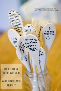
Artsy Crafty runs in the family and my dear sister happens to have her very own craft room too. I’d love to be able to incorporate some type of art into the day. Maybe something to do with a gift to the bride-to-be that all the guests could contribute to?

Here are a couple ideas I found. spoons-via-sweet-cs-designs sticks_4316595

I like the popsicle sticks with date ideas. What a fun concept!

The only thing I’m struggling with is ideas for games to play during the event. Anyone have any suggestions?

Baby Shower Diaper Cake

Got a baby shower coming up? Here’s an idea for a unique gift – a diaper cake! I’ve made a few of these over the years and they are so much fun! The cake itself is made out of diapers and you can decorate them however you want.

Here’s one I made for my cousin’s baby shower a couple years ago.

DiaperCake1

Want to give it a shot? This is what you’ll need to get started…

At least 52 diapers

At least 55 rubber bands

And various baby related items for decorating the cake

This link does an excellent job of showing how to create the layers of the cake step by step. You might need an extra set of hands to get the rubber bands around each layer to hold them together.

I say “at least” in the ingredient list because it all depends on how tightly you roll the diapers and even what type of diapers you buy. Personally I buy a little more than I think I’ll need just to be on the safe side. You can always package up the extras in a cute gift bag and give them to mom too.

The link above suggests cutting a circle out of a piece of cardboard but I’ve just purchased cardboard cake rounds at my local craft store. The ones I found came in a package of three. Or if you’re friendly with your neighborhood pizza place you could always ask them if you could buy a cardboard round that goes under the pizzas.

After you stack the diaper tiers you can get decorating! In my example I made little rosettes out of socks and mittens, attached some hair clips to the edges of the diapers, used ribbons to hide the rubber bands and topped the cake with a cute little monkey.

diapercake2

Here are some other ideas for decorations:

Use colorful patterned paper instead of ribbon to hide the rubber bands

Tuck in some rattles or pacifiers

Add pipe cleaners to create some visual interest. Give them a little curl by wrapping them around a pen or pencil a couple times.

The link I shared shows hiding a blanket in the center as a surprise and adding wooden dowels for stability. I’ve inserted a couple different sized bottles stacked in the center and that seemed to make the cake stable enough without dowels. Fill the bottles with some fun candies as a treat for mom!

Make sure you let mom know if you use decorations that may be perishable.

Does anyone have any other ideas for decorating the cake? I’d love to hear them! Share your thoughts in the comments below.

Spring Flower Power

It’s that odd time in the Northeast between Winter and Spring when the dull, gray days seem to last forever. When Mother Nature likes to tease us with a beautiful, warm day and then laugh at us as snow flurries blow in the next day. How cruel! But I think it makes us appreciate the nicer weather a little more when it does finally arrive and stay.

The signs are out there – robins chirping in the morning, small specks of green pushing their way up out of the hard brown earth. It’s only a matter of time now!

So I was feeling a little Spring-inspired this morning and was looking around online for some papercraft flowers. I ran across this awesome tutorial by Lain Ehmann and was smitten.

She shows us three quick and easy flower designs created with punches. I don’t have the fancy flower petal punch she uses for the first design (I have punch envy) but I do have some circle punches! What a great way to use up some of my scraps.

Here are few samples of what I came up with.

flower1 flower2

Check out her video and let me know what design is your favorite?

Obviously, I’m digging the one with just the plain circles stacked off-center. I think it’s simplicity is endearing. It reminds me of a Raggedy Ann doll…no? Ok, maybe it’s just me then!

Have a great day everyone!

Friday Fun

In addition to arts and crafts, I love health and fitness blogs. I used to be really active in High School but since I graduated College my activity level and health have been in a slow decline. My new year’s resolution is to try to fix that, but I digress. I saw this post on Tina’s blog and then again on Caitlin’s. It seemed like it would be a fun post for a Friday. Feel free to play along in the comments or on your own blog!

1. In baseball each player gets a “walk up song” that plays on his way up to the plate. What song would you pick? 

AC/DC’s Thunderstruck.

2. What’s the best thing that happened to you last weekend?

I went out with my sister to a funky little place called Moe’s Tavern that serves in Craft Beers and we just sat, chatted and had a couple beers. We don’t do that often enough!

3. If you could have a starring role in any film already made, which movie would you pick?  

Breakfast At Tiffany’s because it’s my all time favorite movie.

4. What actor/actress would you have play you in a movie of your life? 

Michele Williams

5. What is your favorite quote? 

Creativity is allowing yourself to make mistakes. Art is knowing which ones to keep.
Scott Adams

6. What was your first concert?

Amy Grant in Pennsylvania.

7. What Internet website do you visit the most?

Facebook…from the time I get up in the morning to the time I go to bed. I’m addicted!

8. Which of Snow White’s 7 dwarfs describes you the best and why?

Happy, because I always try to look on the bright side of things.

9. If you were on death row, what would your last meal be?

Roasted garlicy mushrooms over a creamy, cheesy polenta

10. What is the background of your computer?

My favorite period in art history is Impressionism and my favorite artist is Monet. My background right now is Monet’s Water Lillies.

Where do you find your color inspirations?

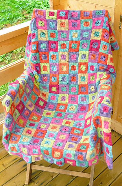
There are certain color pairings that I am just naturally drawn to. They are bright, cheerful colors that are highly saturated in bold and sometimes abstract patterns.

These colors make me smile when I see them. I naturally feel a bit happier.

Here are a couple examples of my favorites.

kiki_23_medium2

http://www.ravelry.com/patterns/library/kiki-crochet-blanket

MiaLinksKeyLime12[12852]

http://www.pineconehill.com/world/shot/95

BoxInBoxDiamondCanary[12074]

http://www.pineconehill.com/world/shot/101

See a pattern there?

Rich, golden yellows

Vibrant, deep pinks

Light, crisp blues

Tart, lime greens

As much as I love these colors, they don’t make much of an appearance in my every day life. The colors in my home are neutral browns and creams with accents of maroon. My wardrobe is mostly blacks, grays and creams with the occasional pop of pink or blue.

You can find lots of articles on how color affects mood in a quick Google search. Here’s one I found on the Huffington Post site. Hmmm, this explains why I have a lot of black clothing!

I also found this presentation on slideshare that does a good job of breaking down the color wheel in easy to digest bits. It’s a quick read and worth checking out if you’re thinking of doing things on for the web/digital.

I feel that as Spring gently knocks at my door, that I should take the opportunity to incorporate my favorite color combos into more of my life and not just limit it to the cards or scrap book pages that I create.

Have any of you done this? Where do you suggest I start…my clothes, my décor? My bedroom has been sorely in need of a makeover!